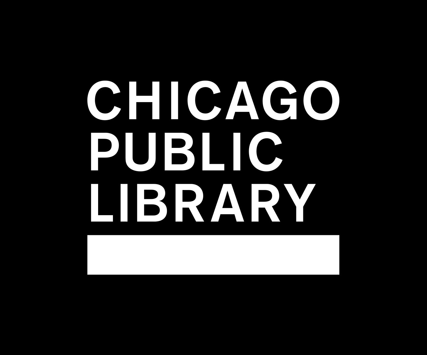
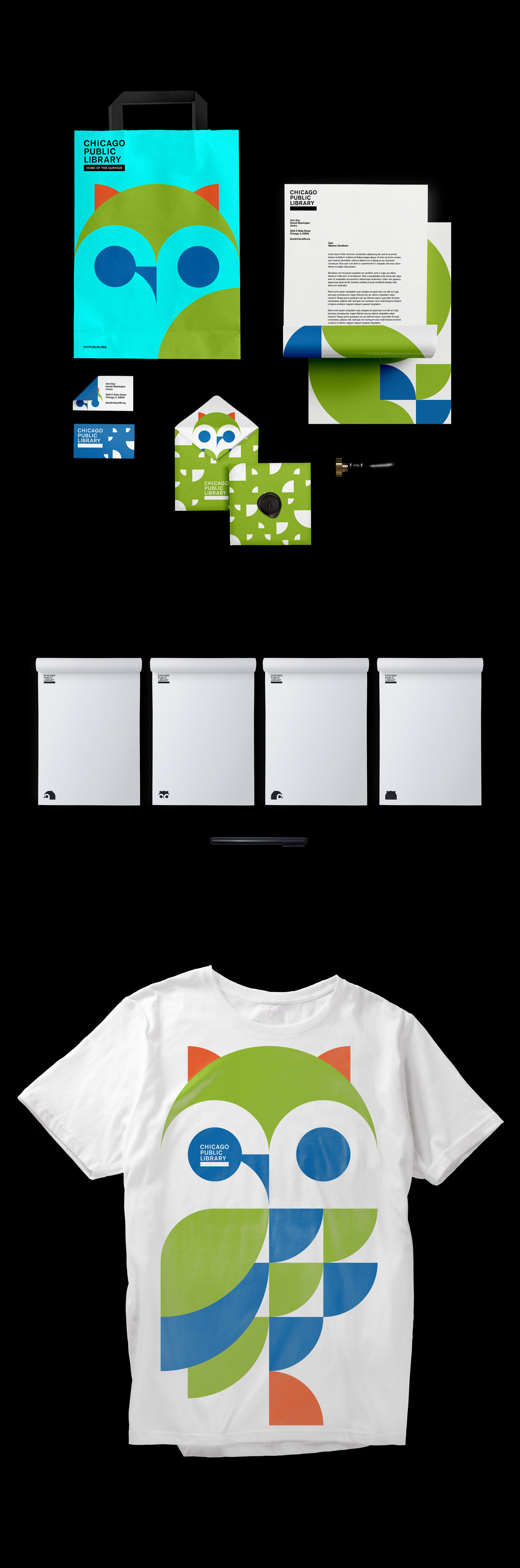
Logo Design
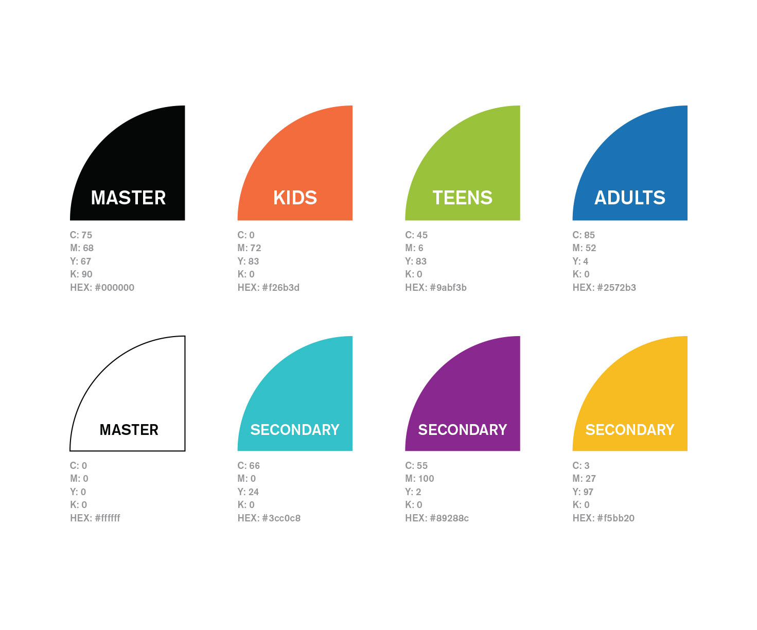
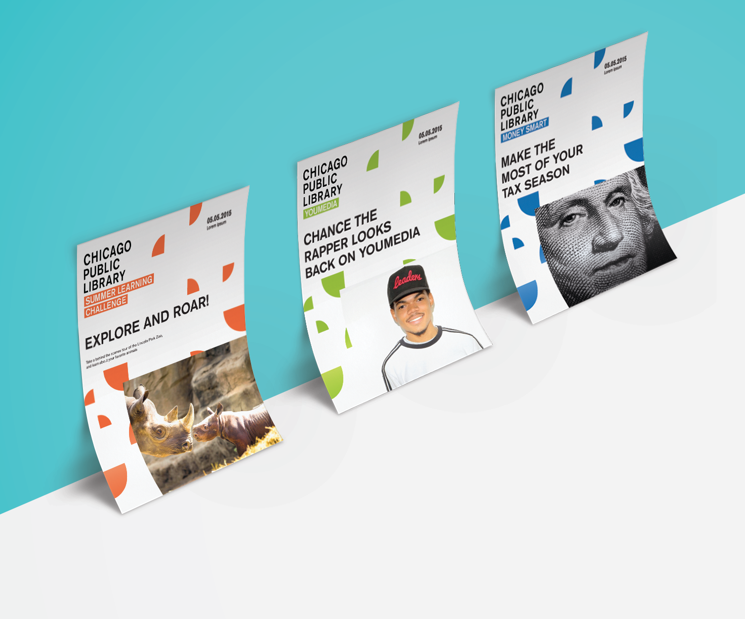
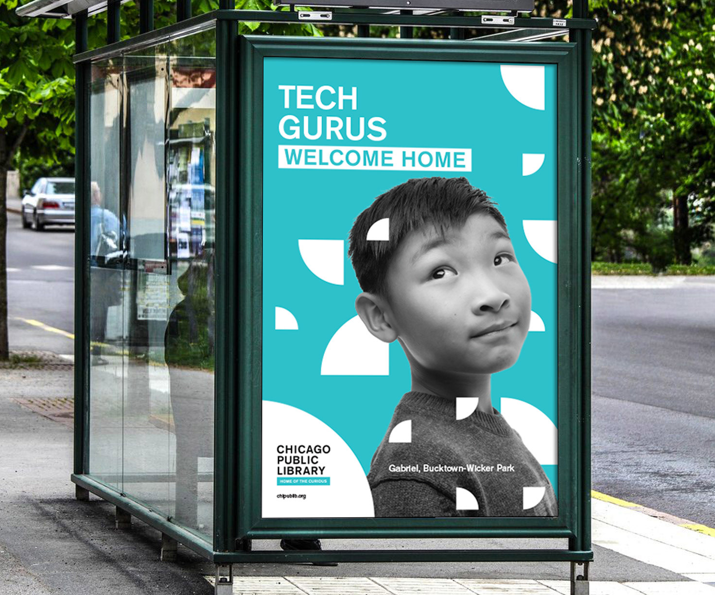
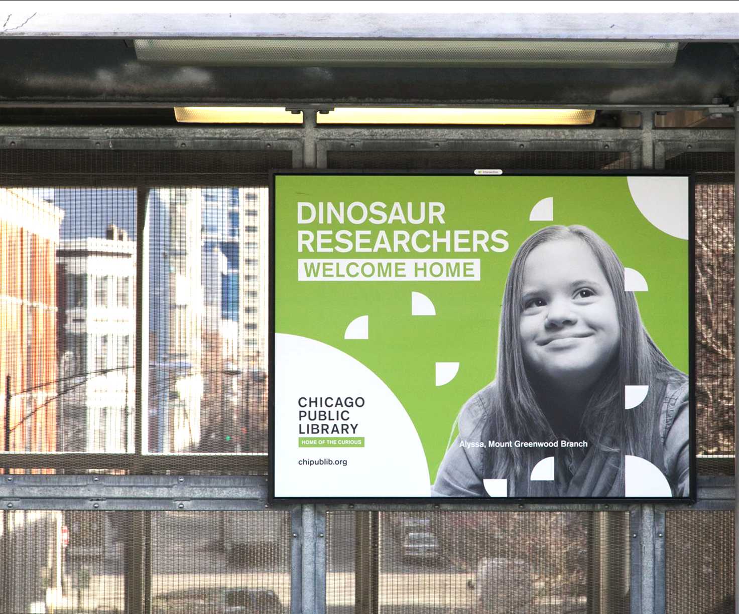
The library was struggling with a logo identity that could house the many programs they offered to the public. At the moment they had completely different logos for each program, and there was not visual cue that they were involved with the library. We chose to simplify their current logotype and introduce a bar that could be used as a way finding tool or a language break.

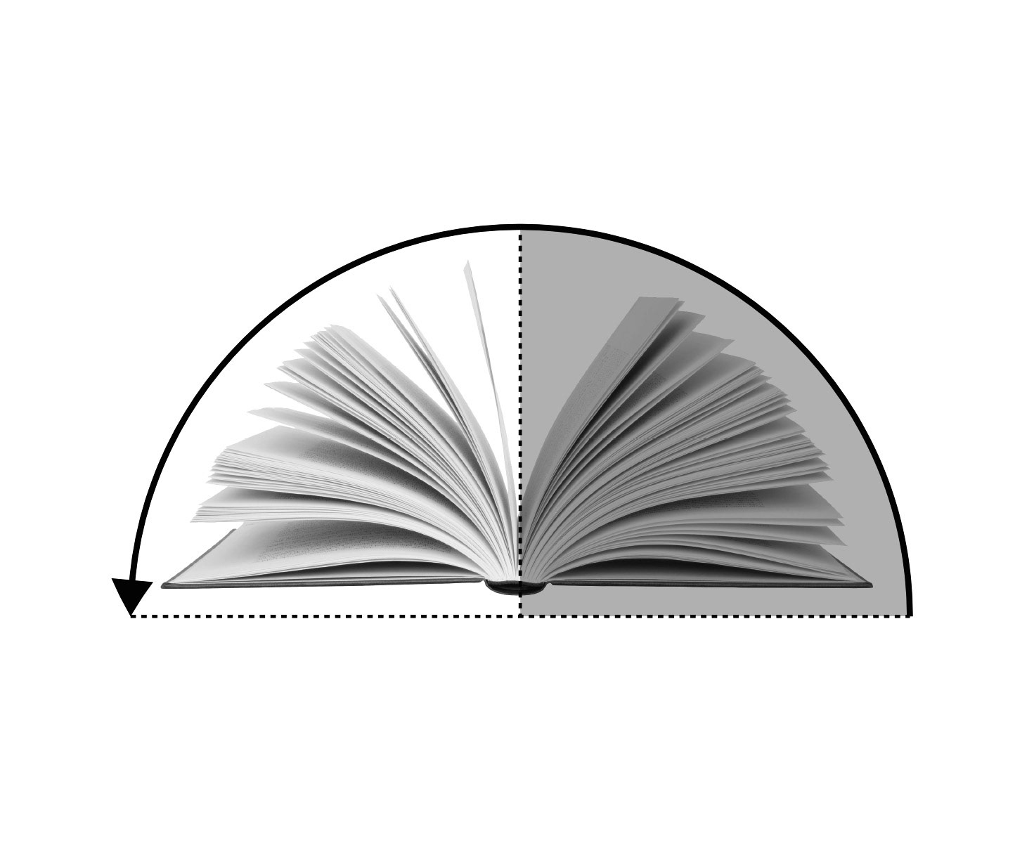
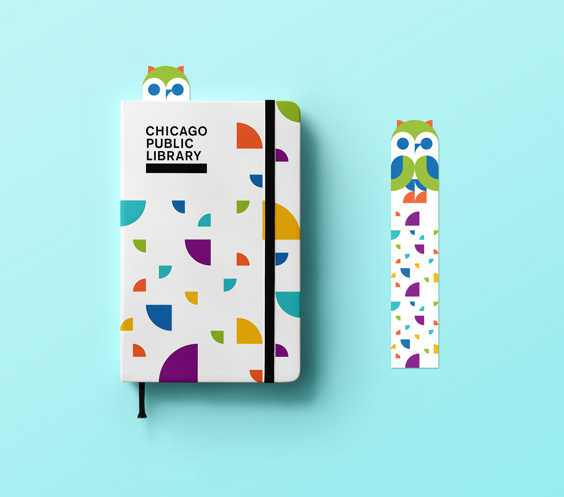
Open Book Motif
Since our logo is very minimal in visual cues, we introduced a simple open book shape to create visual rhythm and an identifier that represents curiosity and exploration.
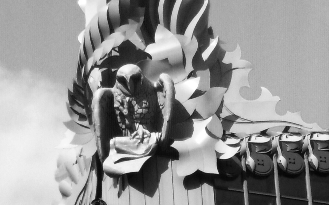
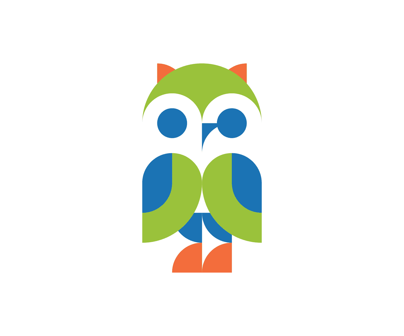
THE Owls
When you visit the Harold Washington Library, the flagship library in Chicago, you'll notice owls placed along the roof. We wanted to incorporate these identifiers into the brand as a fun element of the library's personality.


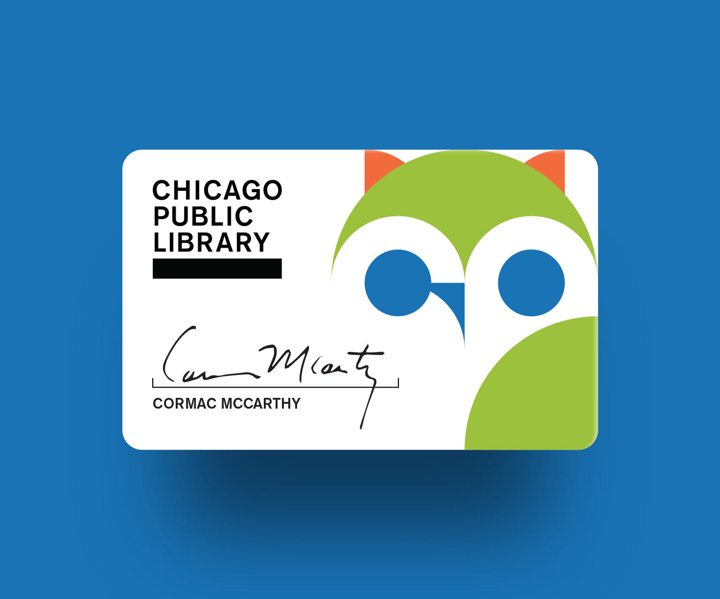


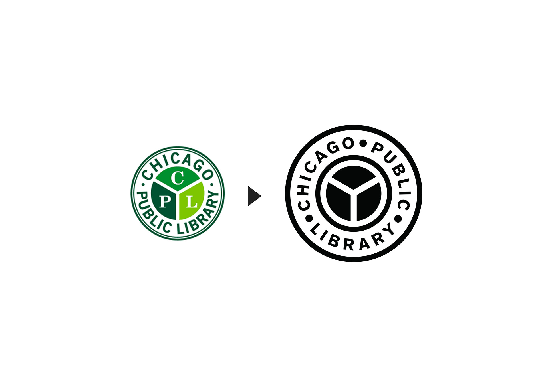
Library Seal
The library seal also needed an overhaul. We kept it around for internal use due to the importance of tradition. By simplifying it, we made it more legible and less redundant.

AGENCY / FCB Chicago
ROLE / Design Lead, Art Direction